
BRAND
PROJECTS
Brand Identity
Product Design
Packaging Design
ROLES
Creative Director
Designer
Illustrator
Photographer
Made for play.
Designed for the home.
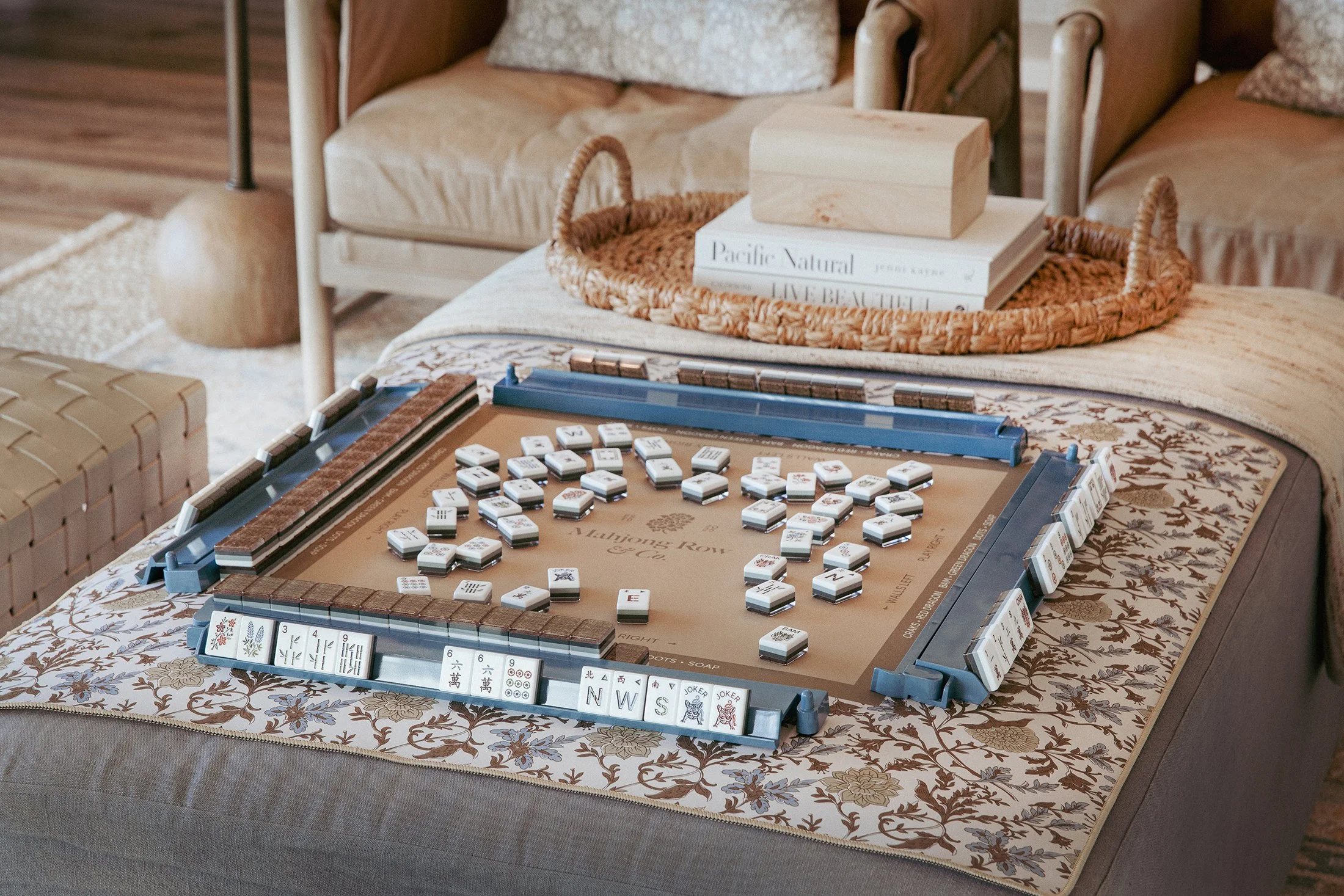
Founded by Tricia Kane, Mahjong Row & Co. creates mahjong sets and accessories inspired by beautiful interiors. While designed for the American style of play, the brand is rooted in a deep appreciation for the Chinese version of the game and the cultural traditions that continue to shape it.
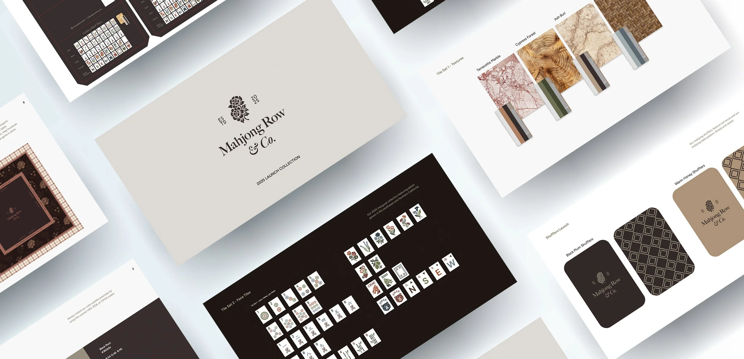
From our very first conversation, Tricia and I shared a vision of creating heirloom-quality pieces that felt equally at home on a table or as part of the living space. Inspired by earthy tones, natural textures, and quiet luxury, we set out to build a complete brand from the ground up—from the visual identity and tile illustrations to mats, accessories, packaging, photography, and launch content.
For me, the project also carried a personal significance. My family is Taiwanese, and mahjong has long been woven into our family history. Growing up, my mom shared stories of returning home from school to my grandparents' apartment in Taiwan, where neighbors gathered nightly around the mahjong table, the clack of tiles throughout the home alongside the smell of dinner wafting out of the kitchen. My grandmother knew her tiles so intimately she could identify them by touch alone. That history became important to my design process, and I wanted to honor the visual language and spirit of traditional mahjong while creating something for the American game.
The details tell
the story
Tricia and I were introduced through a mutual contact and quickly discovered we shared more than a love of beautiful interiors. With our Texas roots and appreciation for craftsmanship, collaboration came easily from day one. At a time when much of the American mahjong market skewed more bright and traditionally feminine, there was an opportunity to create something different.
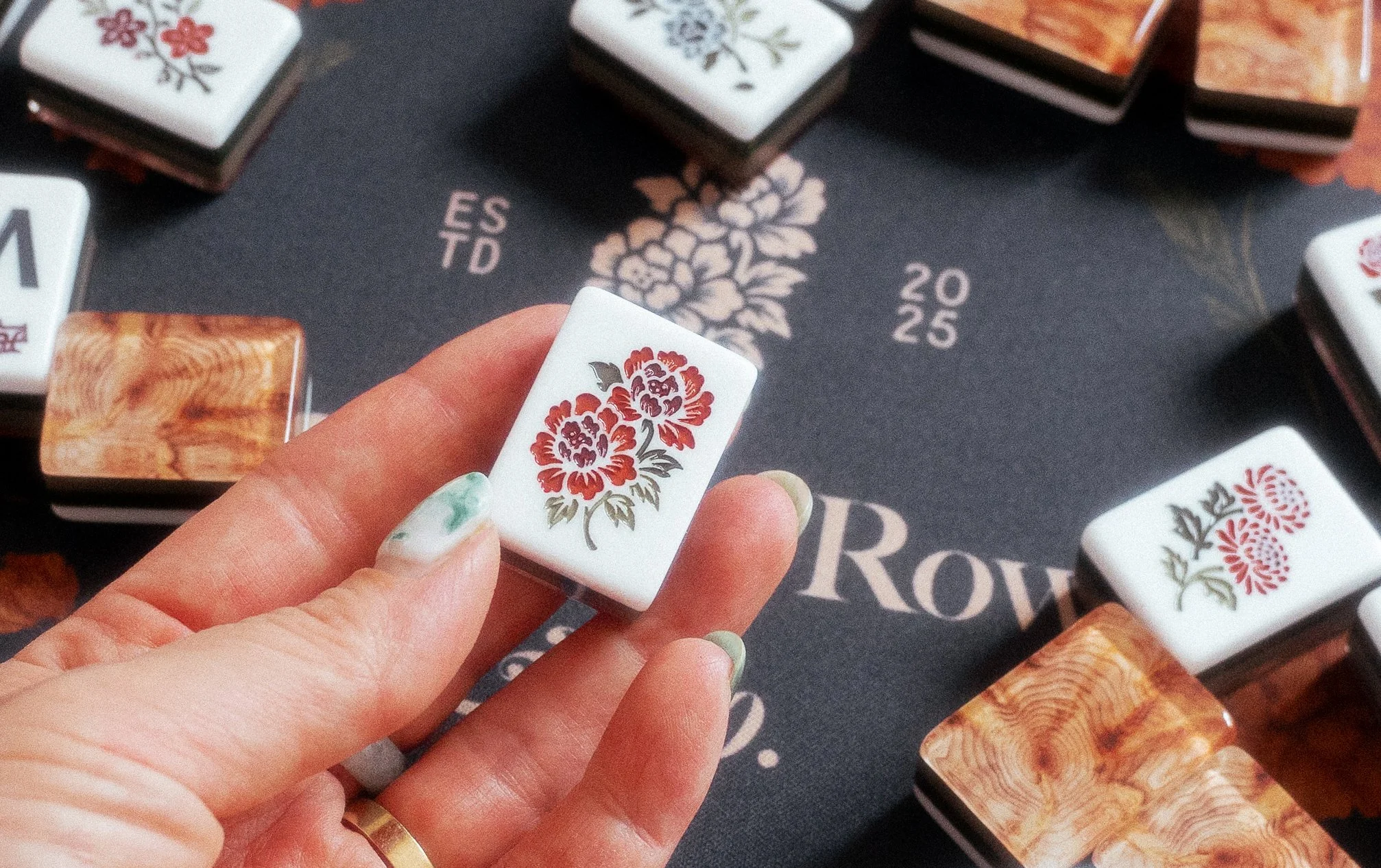
As the collection began to take shape, we found ourselves making many of the same creative choices. When selecting our favorite flowers for the tiles, we both picked peonies which inspired our Double Peony tile. My illustration later became part of the brand's signature wordmark lockup.
Research before rendering
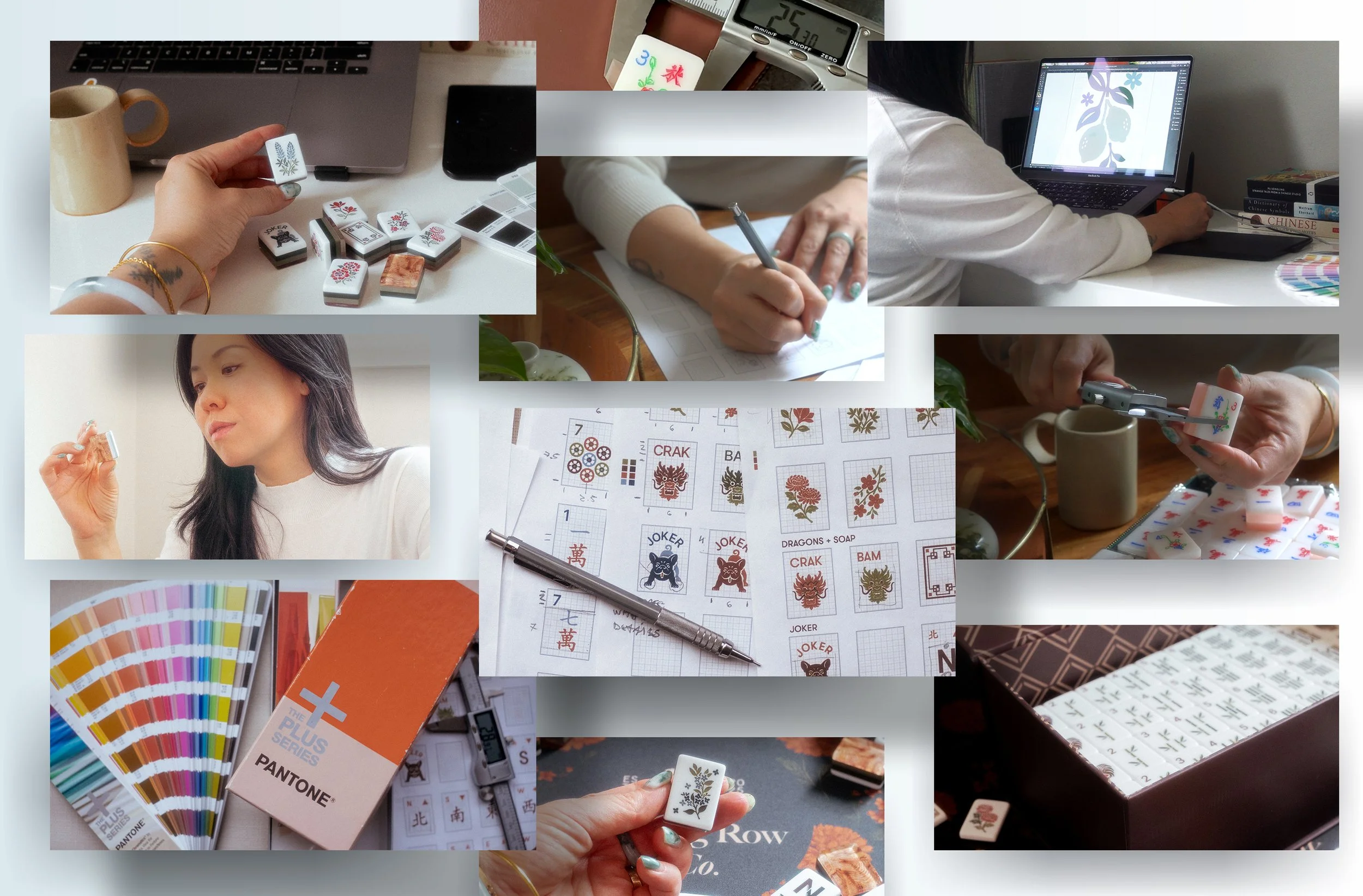
Before putting pencil to paper, I immersed myself in the history and physicality of the game. I wandered through San Francisco's Chinatown, buying mahjong sets in a variety of sizes to understand how different tile proportions and weights felt in my hands. I studied my mom's mahjong set, observing the artwork and composition of each tile. Because the origins of the game was so important to me, every design decision began with learning before creating.
Inspired by grid-based design, I roughly sketch the tile illustrations before refining in Adobe Illustrator. Countless hours were spent comparing Pantone swatches with Tricia until the collection felt cohesive.
Sold out in minutes
The first run of the Cypress Tile Sets sold out
in less than two weeks, followed by multiple
limited-edition drops that sold out in minutes
16K
Instagram followers
in the first 6 months of launch
A collection,
not just a set
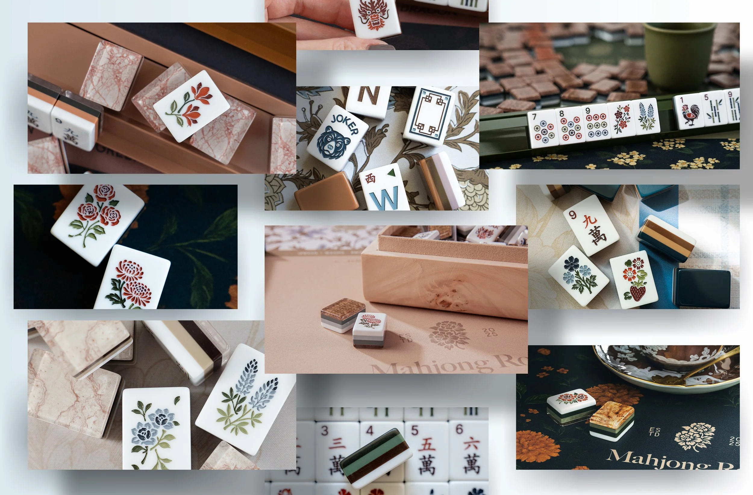
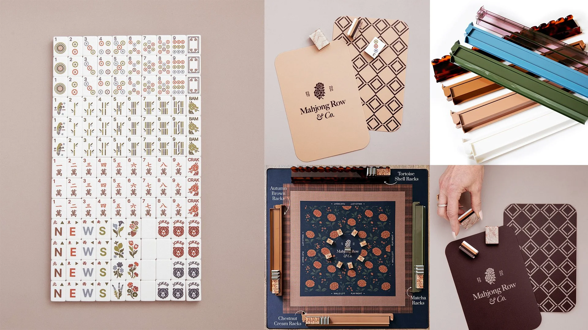
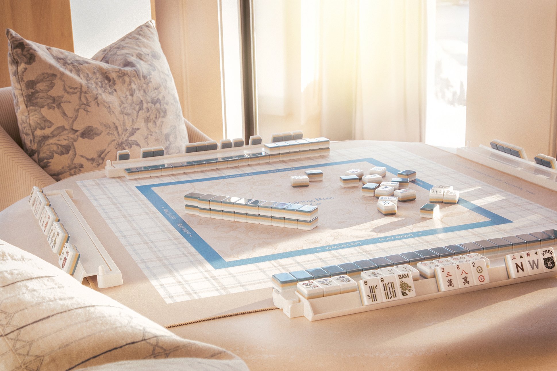
We debuted with an inaugural collection of eight mahjong tile sets, eight mats, seven racks, and two shufflers. Rather than creating a single matching set, we designed each piece to work together, giving players the freedom to mix colors and textures to create a table that felt uniquely their own. Inspired by the way people thoughtfully curate their home decor, the collection encouraged self-expression while maintaining a cohesive visual language across every product.

“I met Monica through one of my husband’s business contacts. The three of us have created a partnership rooted in shared values and creating beauty with purpose. Monica’s incredible talent and eye for design have enabled us to launch this dream family business.”
- Tricia Kane, Founder, Mahjong Row & Co.
Open to interpretation
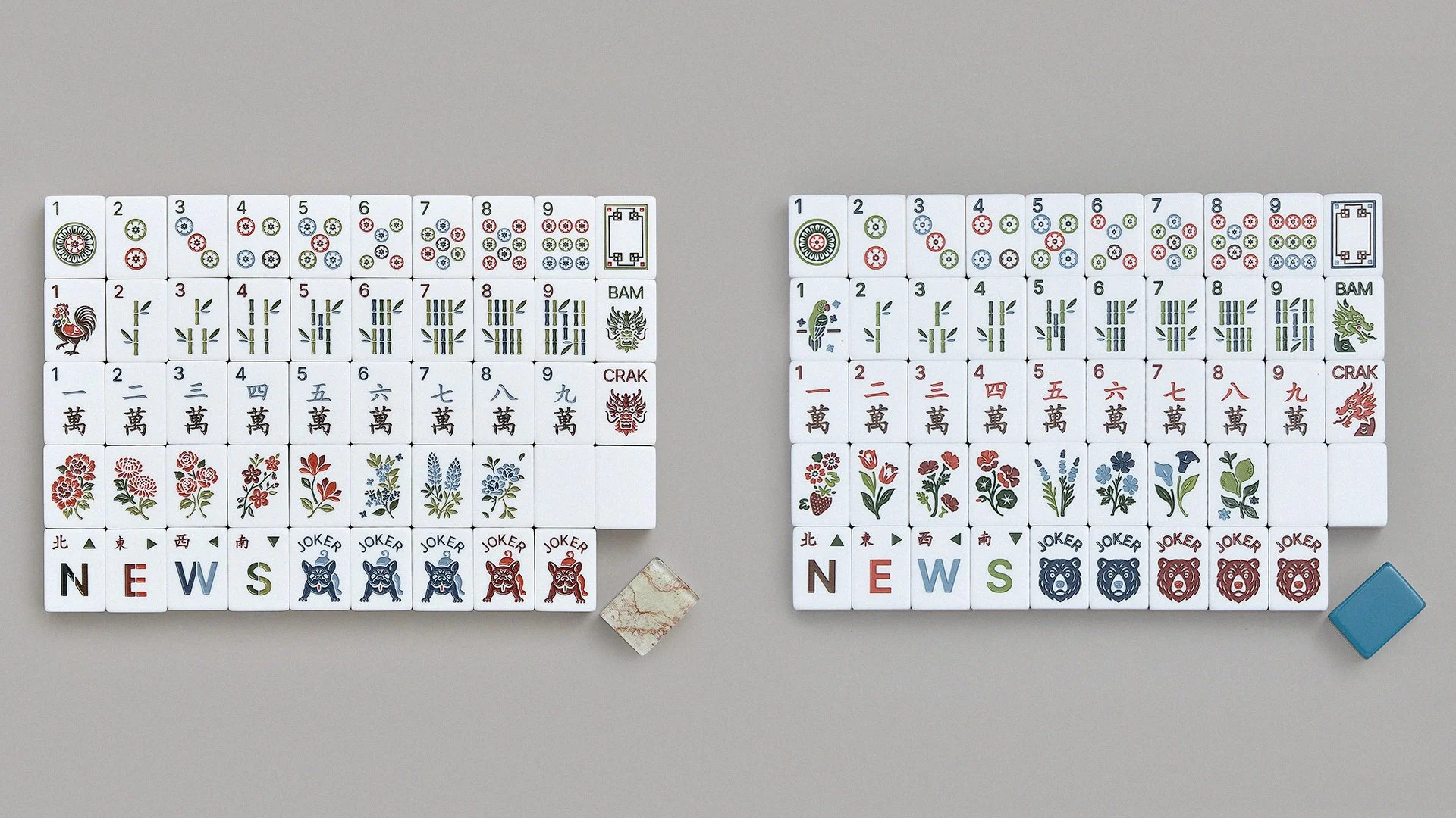
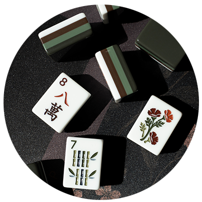
Rather than decorating the tiles with motifs purely for aesthetics, I wanted each illustration to carry a story. The textured tile collection draws from both my Taiwanese Texan upbringing and Tricia's Texas roots, weaving together flowers and symbols that have shaped us. Peonies, chrysanthemums, osmanthus, magnolias, bluebonnets, roses, and cherry blossoms became quiet nods to family and place.
Some details are even more personal. The joker tile features a pug (or frenchie!) as love to the pups that were known in our house as "the clowns of the animal world." The rooster bird bam honors my husband's zodiac, while the Double Peony tile became both a favorite symbol within the collection and part of the brand's wordmark.
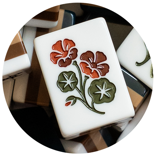
The second, solid-colored tile collection hits closer to home, drawing inspiration from the plants growing right outside my door. California poppies, lavender, nasturtiums, strawberries, Meyer lemons, and calla lilies were all inspired by my San Francisco garden, while the California bear anchors the collection as a tribute to the state I now call home. Even the bird bam celebrates a local celebrity, the wild parrots of Telegraph Hill.
Every illustration began with a memory or meaningful reference, but I don't believe symbols belong to just one person. Like all art, these motifs are open to interpretation, inviting players to create their own associations.
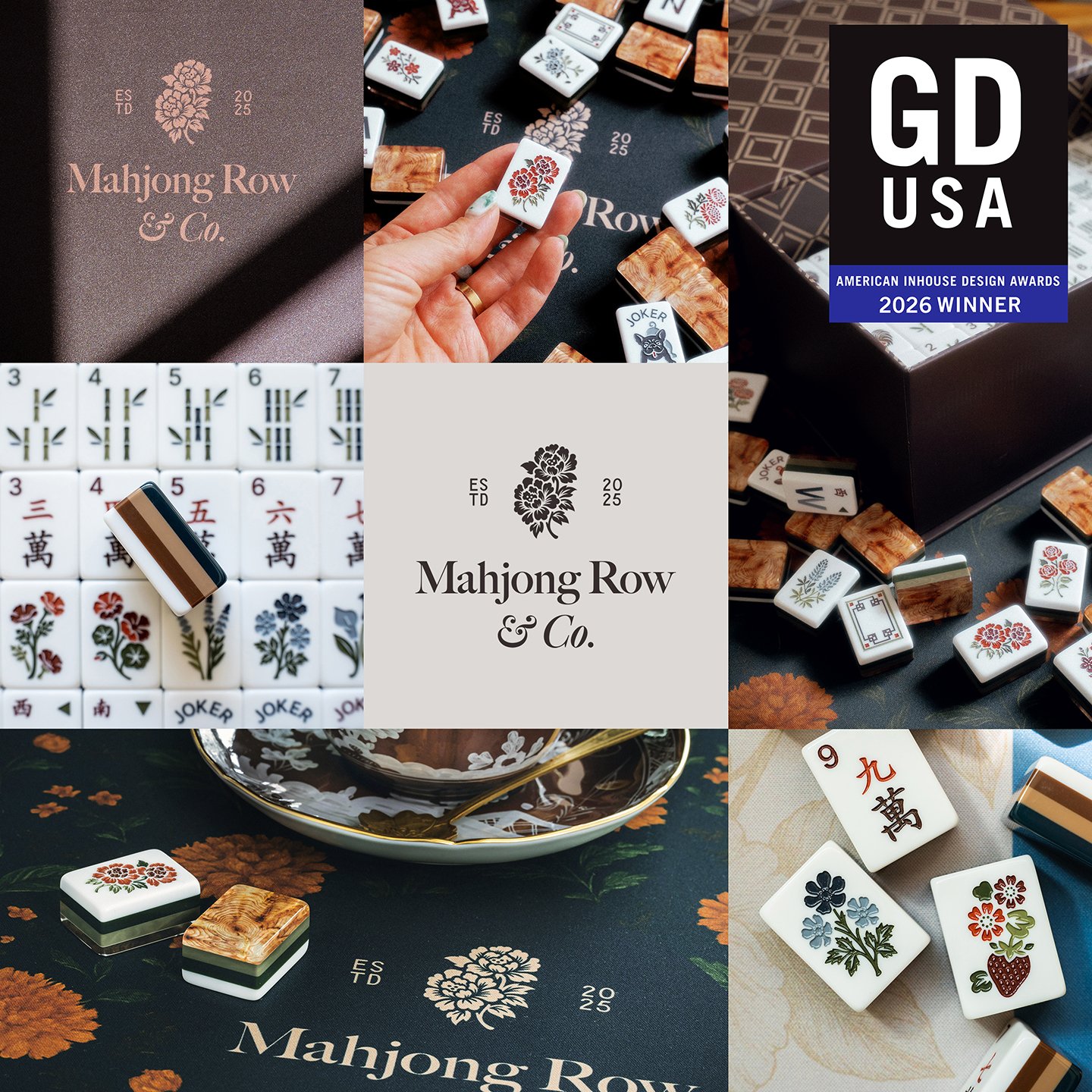
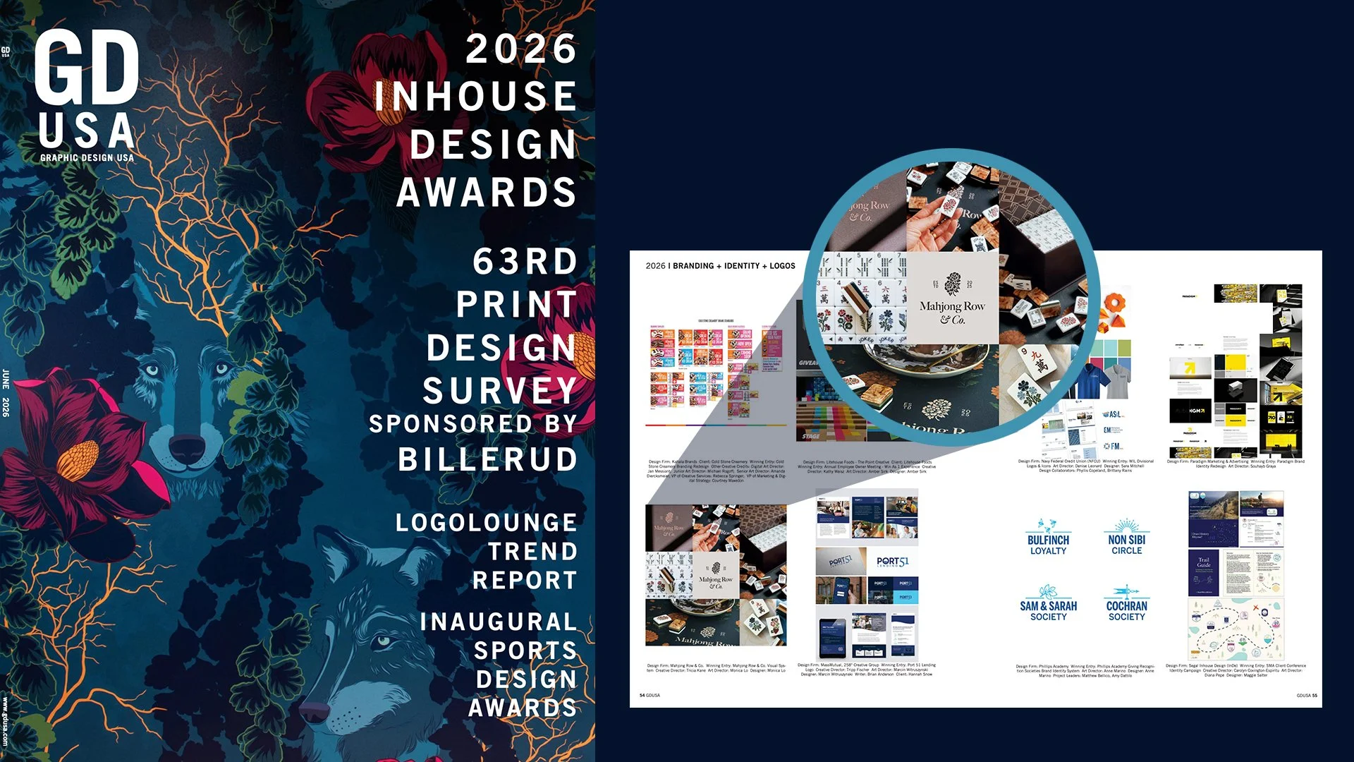
Winner of a 2026 GDUSA Design Award™
“I will be selling my mahjong set and promptly upgrading to Mahjong Row & Co. Omg this setup is so chic and the tiles actually make sense (the creative tiles are confusing AF.)”
- Cynthia R.
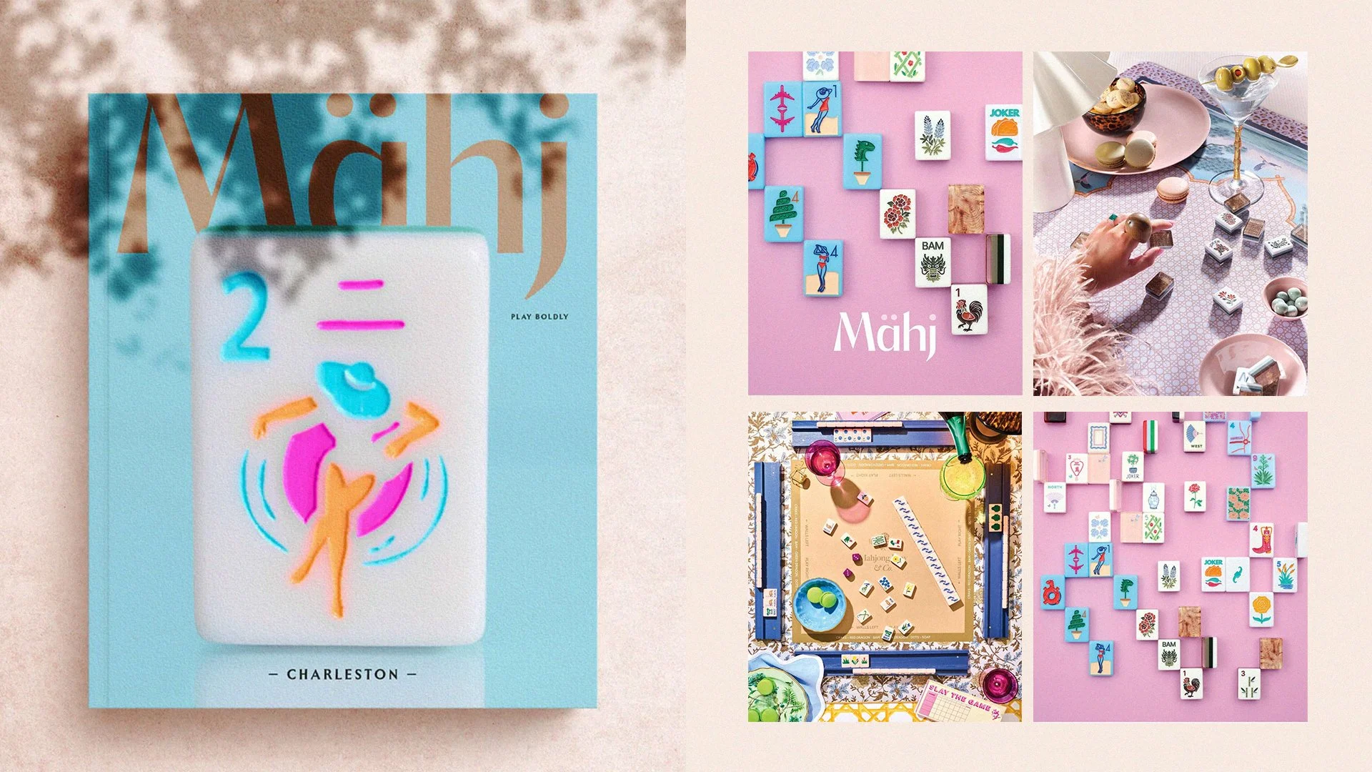
Mähj Magazine Feature
“These are beyond beautiful! You can tell the time and care that went into developing each and every detail!”
- Becca W.
Giving back
This project gave me the opportunity to celebrate my own heritage in a meaningful way. As someone who grew up in Dallas, I wanted that impact to extend beyond the work itself, so I donated a portion of my income to the Dallas Asian American Historical Society. I hope it helps support the next generation of Asian American creatives in finding the cultural connection I longed for growing up.